
The Daily Cannon
We created a bold, playful identity for The Daily Cannon, Nick Cannon’s debut morning show on Amp. The visual system captures his unfiltered personality and sets the tone for a new kind of morning radio experience.

Project Overview
Amp brought us in to develop the visual identity and campaign system for The Daily Cannon, including a logo, custom illustrations, launch copy, paid social, and DOOH assets. The challenge was to balance Nick’s larger-than-life voice with Amp’s brand, while creating something vibrant and personality-driven that didn’t feel like a traditional radio show.
Scope:
Visual ID & Messaging
Brand:
Amazon Amp
Year:
2023

My Approach
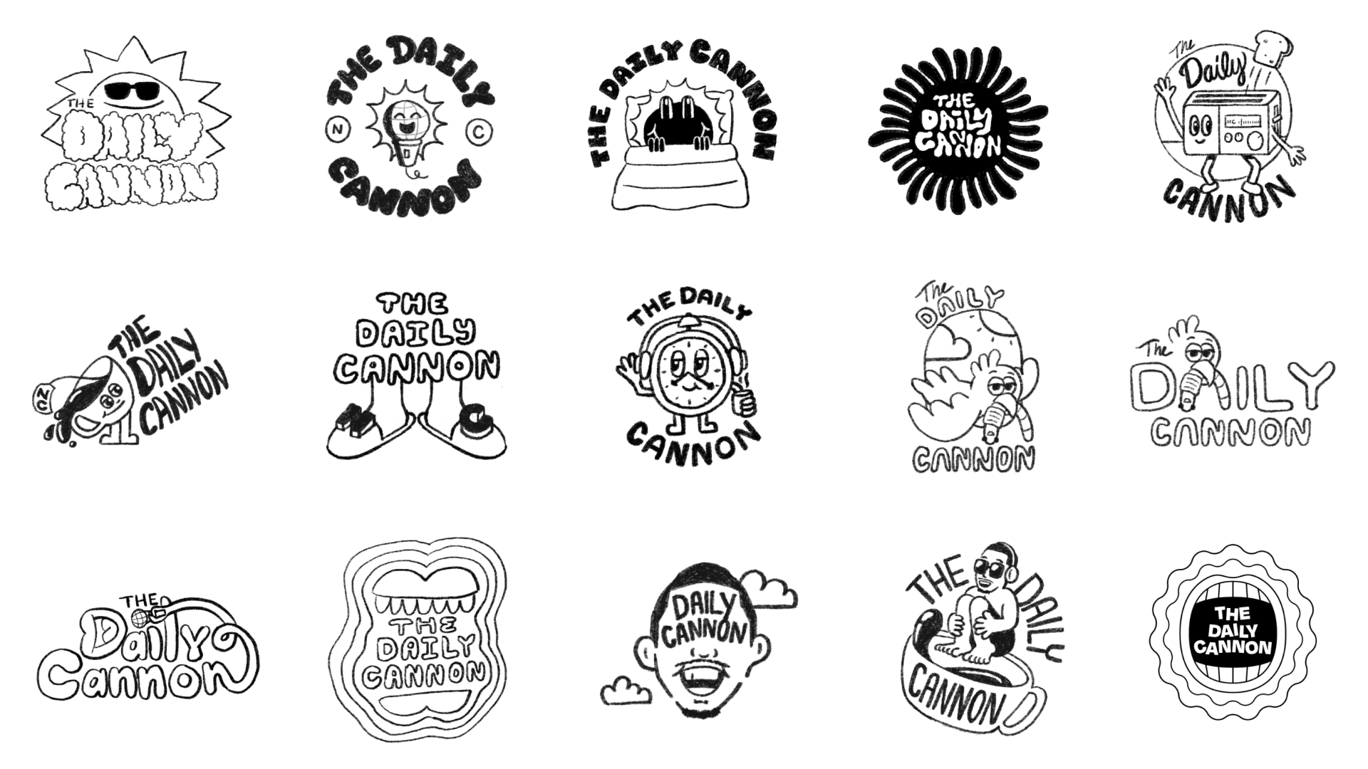
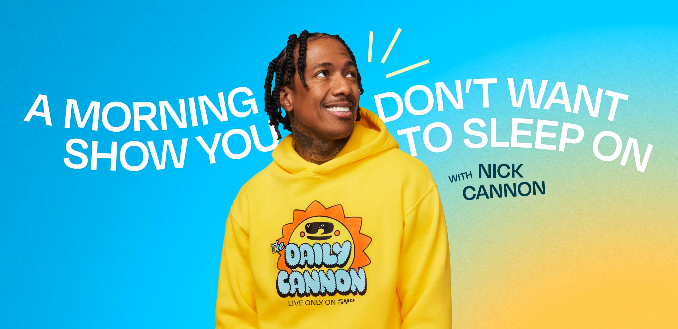
I led the creative direction, beginning with the logo. Nick Cannon had a clear preference for branding that included a sun, but we wanted to explore a broader range of visual ideas that could represent the tone of the show. Through fast, collaborative sketch sessions, the team explored sun motifs, breakfast metaphors, and character-driven marks. After a few rounds of internal refinement, we shared a focused set of directions for review. Nick responded positively to several, but ultimately chose the sun-based concept that felt most aligned with his personality.
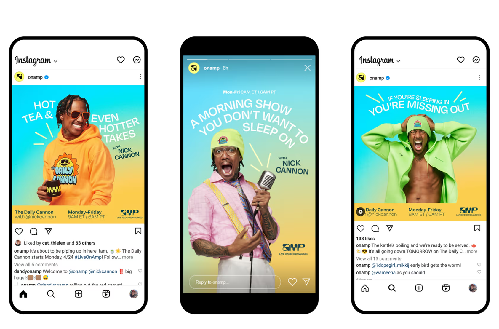
Once the logo and photoshoot were approved, we extended the identity into a full campaign. We adapted it across social, DOOH, and other placements, using a sunrise gradient, expressive layouts, and hand-drawn elements to keep the system bold, flexible, and fun.
We also handled the launch copy. To avoid traditional “tune-in” language, we focused on writing that felt cultural, conversational, and platform-first. The headlines positioned Amp and Nick as unfiltered and unlike anything else in the morning space.
The Team
Creative Director Angela Sturrus
Senior Art Directer Cat Thielen
Copywriter Danielle Chesney
Senior Producer Leo Nouhan
Motion Designer Isabelle Souri
Senior Designer Johnathan McGhee
Designer Phil Zhang
Designer Randy Renteria
Designer Tomi Rosanwo
Building It Out
We designed a modular system that could stretch across formats without losing its personality. The visuals used outlined forms, round organic shapes, and bold color fills, with thickened lines and subtle highlights to add punch and depth. Motion, messaging, and design were developed in parallel to keep everything aligned and adaptable.
The Outcome
The identity struck a balance between Amp’s bright, system-forward brand and Nick’s bold, unpredictable tone. The campaign rolled out across social, DOOH, and platform placements, earning strong feedback from both the client and their audience.

More Projects


Let's Work Together
Whether you're hiring, looking for a creative partner, or need fresh eyes on a project, I’m open to freelance, full-time, or consulting opportunities.